Khoa Nguyen
Menu
Cisco Commerce Workspace
Streamlining B2B Commerce: Cisco's Transformative UX Strategy
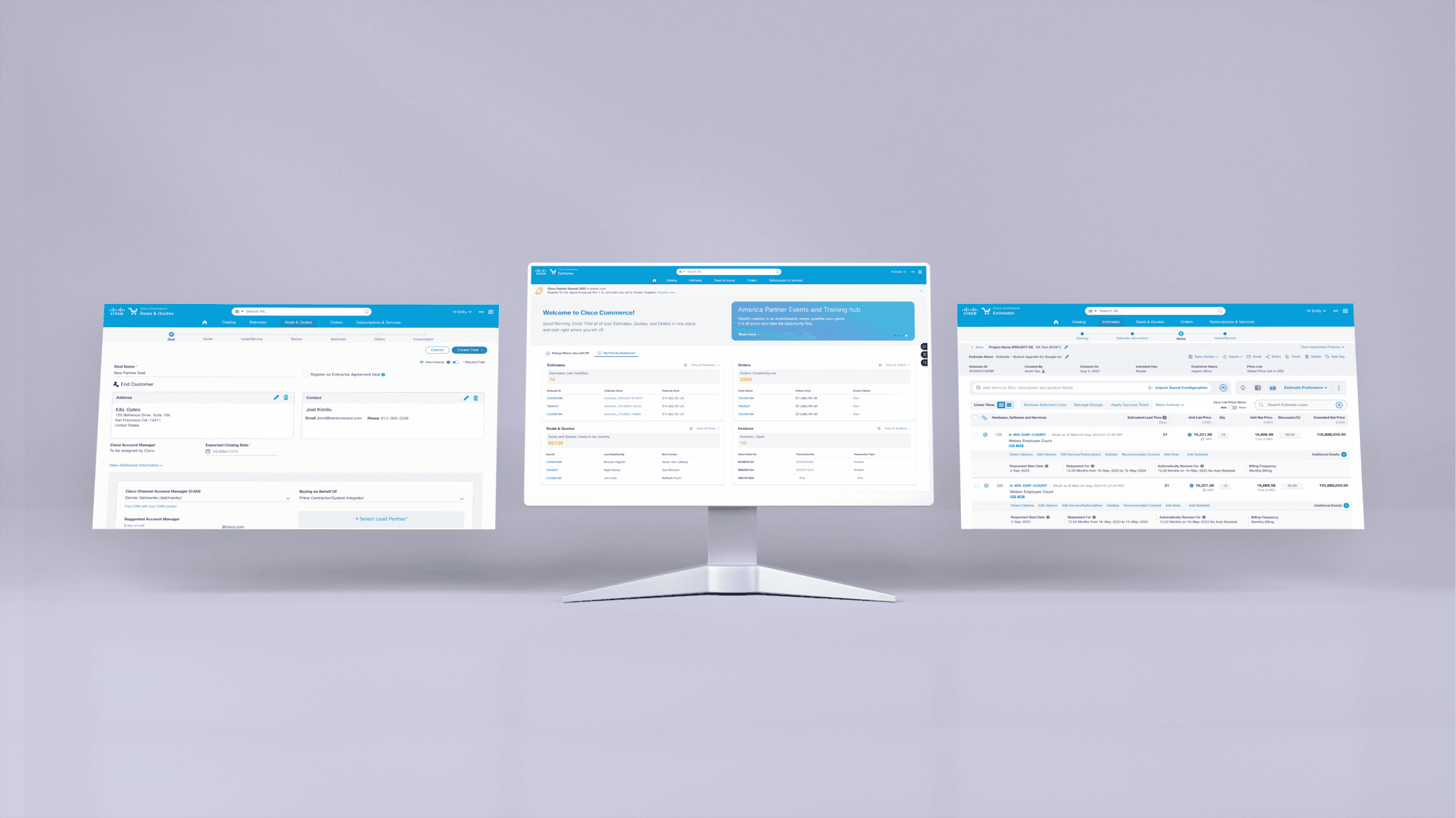
Cisco Commerce Workspace (CCW) is a comprehensive enterprise B2B platform designed to streamline and optimize the quoting, configuring, and ordering process for Cisco products, software, services, and subscriptions. This unified tool aims to enhance efficiency for Cisco partners, resulting in faster bookings and significant productivity gains across the sales lifecycle.
Role: Lead UX/UI Designer and Project Manager
Shipped: 2024
Keyword: UX Research, User Testing, Design System, UX/UI Design
My Role
As the lead UX/UI Designer and Project Manager, my role was to lead the design and implementation of a user-centric interface that would simplify the complex B2B purchasing process. Through meticulous research, user testing, and iterative design cycles, I aimed to create a cohesive and intuitive experience that would elevate Cisco's B2B platform, fostering increased customer satisfaction and loyalty.
Challenge
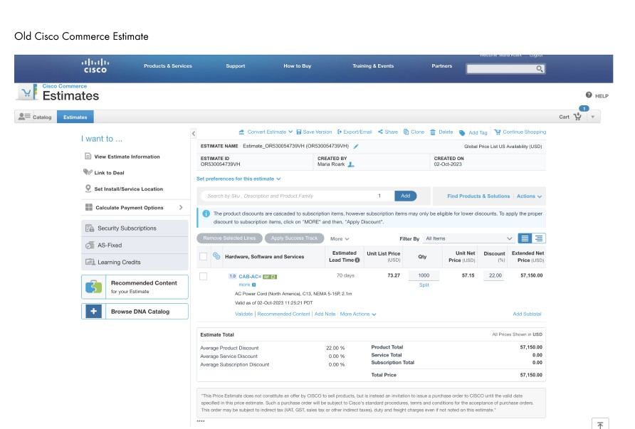
Cisco Commerce Workspace were grappling with inefficiencies that preventing their Enterprise partner’s productivity and success rates, which data shows that it takes days if not weeks to complete a deal cycle. The existing configure, price, and quote (CPQ) solution, intended to simplify the sales process, overwhelmed users. The experience was fragmented, inconsistent, and filled with error-prone processes. This scattered landscape not only impacted sales efficiency but also jeopardized the customer experience, highlighting the urgent need for a thorough redesign of Cisco's sales infrastructure.
Business Goals:
Create a cohesive experience for user to go from Estimate, Quote, Configure, and Order within CCW
Reduce the deal cycle time
Research
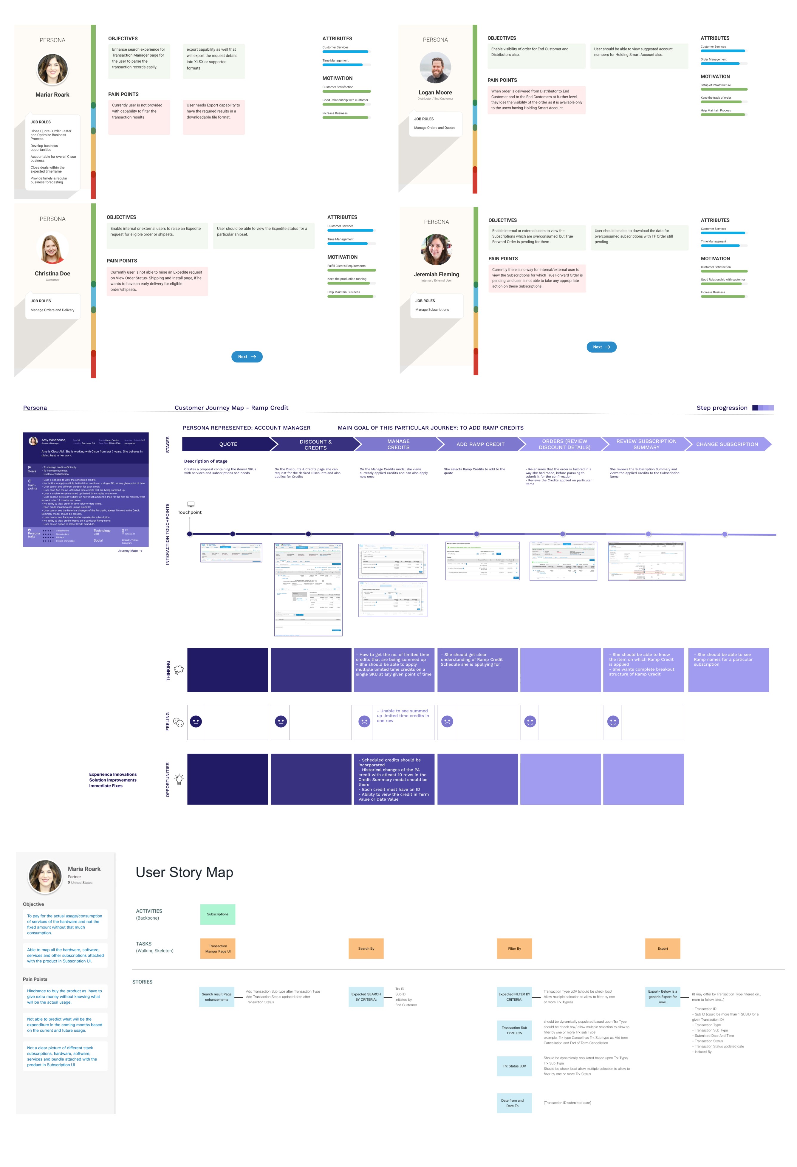
We began the project by speaking with a few stakeholders, sales teams, and partners to gain key insights and identify major personas across all CCW tracks. We then defined their goals, expectations, touchpoints, experiences, and pain points and organized them through journey map exercise. This intense exploration into the lives of our users unveiled inconsistencies within the existing CCW tracks.
Key Problems:
Users are overwhelmed with contents at any given moments
No clear progress trackers where users are
Repetitive features with different names and experiences between CCW tracks
Ideate
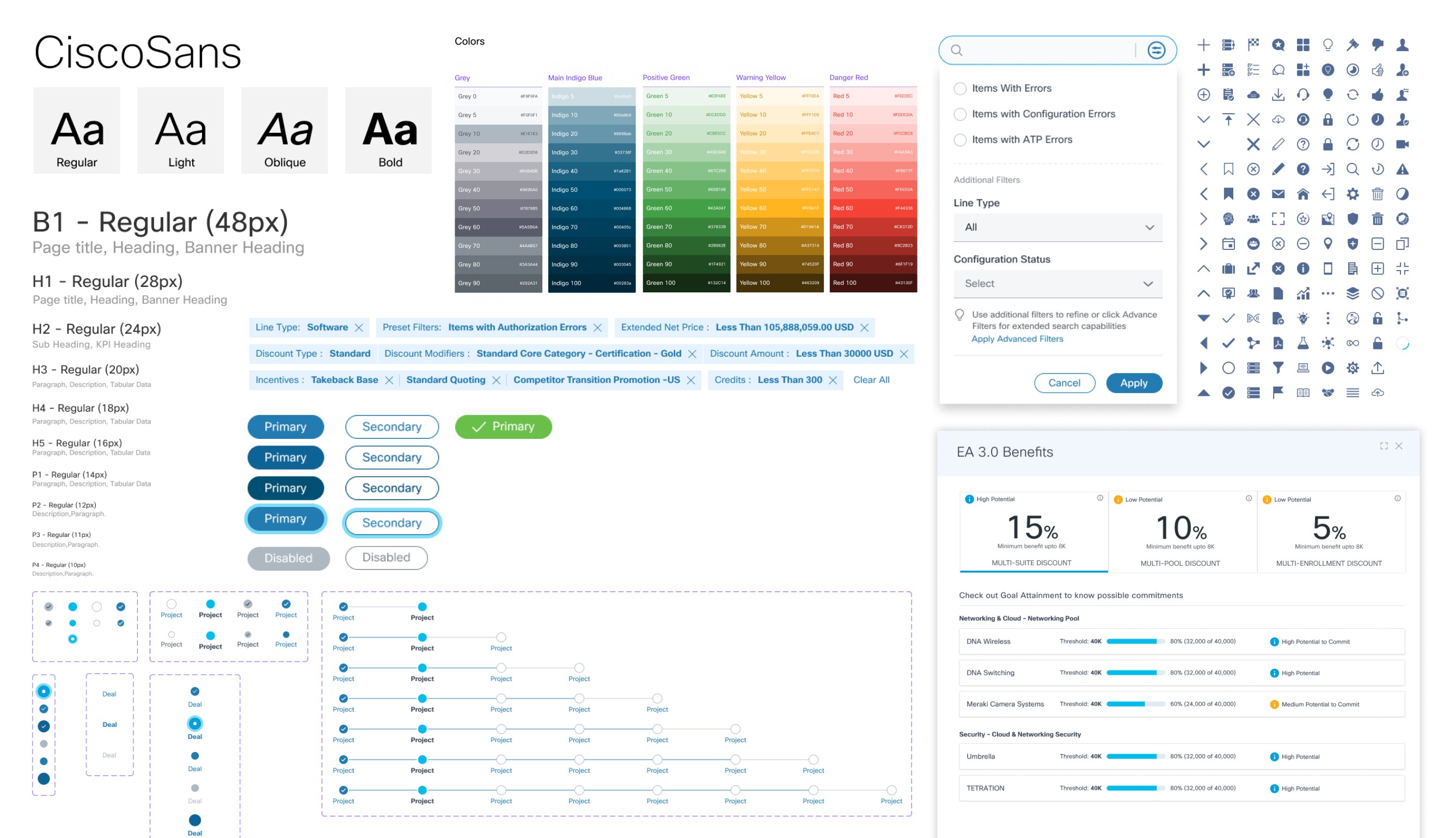
After gaining a deep understanding of the problems and user needs, Design team engaged all the CCW teams to address our findings of repetitive features and promote Agile collaborative environment within the team. Additionally, we looked at all the existing features in the CCW tracks to simplified the features by developing the design system for consistency, reusability, and increase development velocity. The goal is to help partners see familiar design patterns and contents across the tracks and helps them finish their tasks faster. We simultaneously developed wireframe concepts that addressed our main issues.

Progress Bar
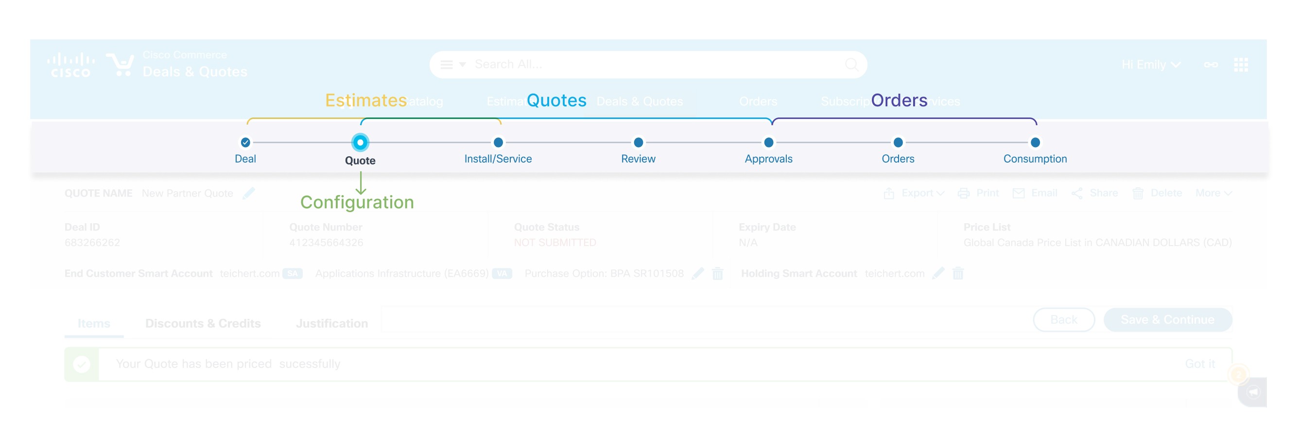
Partners become overwhelmed and were unable to proceed since there is no progress th show were they are in the entire CPQ process. There were attempts to show progress through the Tabs design in Estimate, Quote, and Order; however, it wasn't clear, and partners had to go back after clicking on the Save and Continue button. To solve this problem, we simplified the complex process of Cisco CPQ deal into linear steps to keep the users informed and engaged. By only showing 5 steps to complete a deal across all the tracks, the user is motivated to complete their tasks, which shortens the deal's decision time.
Simplified the Detailed View
With the complexity of CCW Enterprise, each deal could contain combinations of multiple hardwares, softwares, services, subscriptions, and/or bundles of everything in between. Cisco partners are often overwhelmed when looking at a major product or bundle with multiple minor products attached. On top of that, there are also discounts, credits, and additional information related to each individual product they offer.
We address this problem by:
Prioritize the most important information up front along with must-have information and breakdown product information into most important and into smaller chunks. This means showing all major products and bundles first, along with must have info related to them.
Include a small Call to Action section with important links related to the major products or bundles.
Expand and learn more about other products that come with the original product in clear visual hierarchy cues. With bundles and products that come with other products (free products, subscription terms, etc.), partners would be able to visually track and understand the complexity and prevent being overwhelmed with all the information

Outcomes
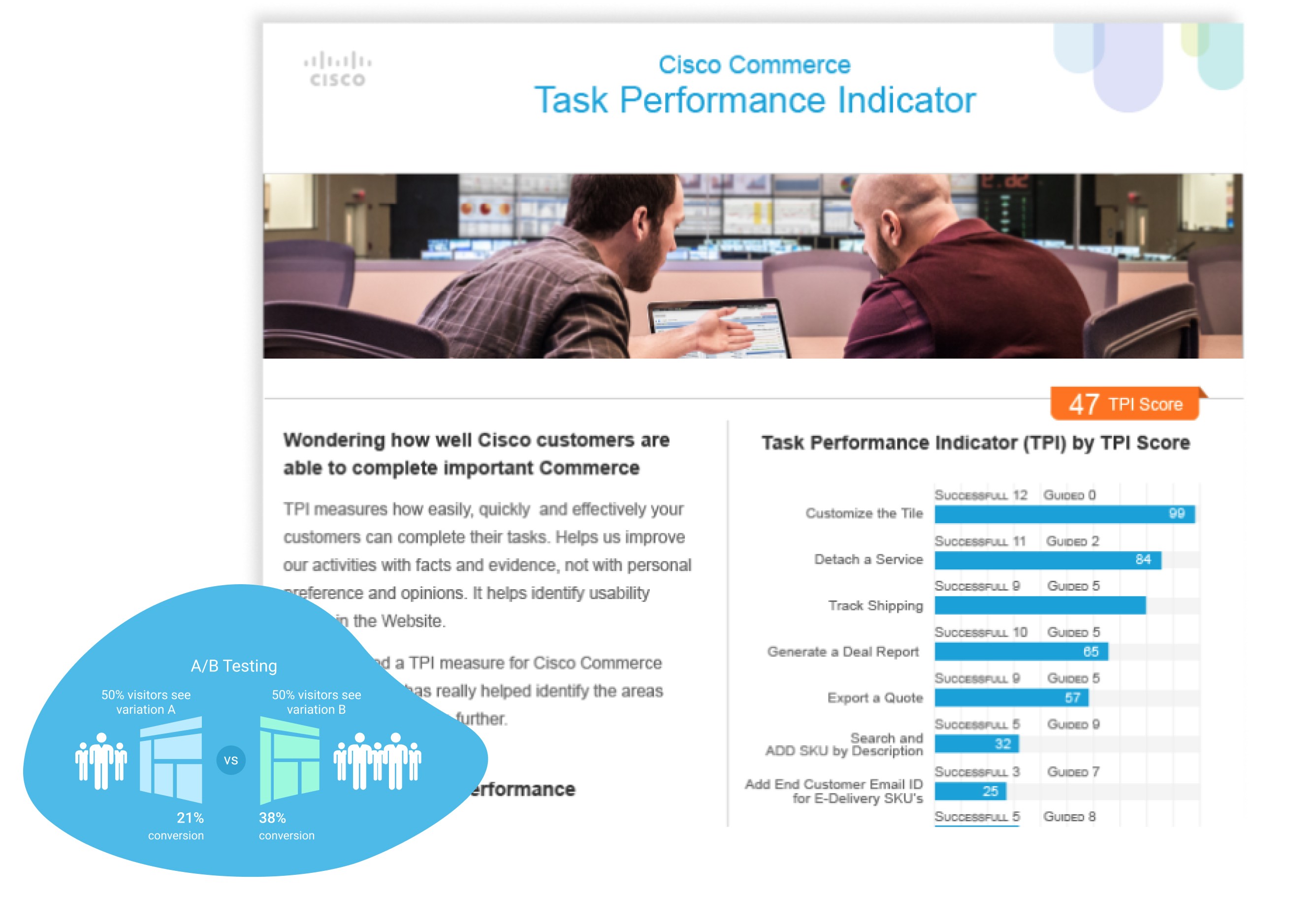
To validate our solution above, we conducted thorough testings with our partners and internal sale teams. Additionally, we use Task Performance Indicator (TPI) assessment, our internal tool, to pinpoint areas for further refinement and enhancement. The new implementation of CCW resulted in significant improvements to the B2B buying experience. Partners' productivity gains of up to 25% due to decreased cycle times from deal creation to order processing. The consolidation of 21 Commerce tools into 1 platform led to faster bookings and increased efficiency for Cisco's partners. Additionally, the new system enabled a 3x faster deal cycle time, 5x more quotes generated, and 85% of customer interactions powered by an AI chatbot, demonstrating substantial enhancements in partner productivity and customer.
3x
Faster Deal Cycle Time
5x
More Quotes Enhancement in Partner Productivity
85%
of All Customer Interactions Powered by AI Chatbot

What I Learned
The project's success was dependent on a comprehensive approach that combined deep user research, collaborative ideation, and iterative design processes to create a cohesive and user-centric B2B platform. By focusing on streamlining complex processes, developing a design system for consistency, and constantly validating solutions through testings, the team was able to achieve significant improvements in deal cycle time, partner productivity, and customer interactions. This project showcases how crucial it is to align UX strategy with business goals, emphasize the value of cross-functional collaboration, and leverage data to make successful enterprise-level solutions.
“
Thanks to a consistent, cohesive user experience and standardization across tracks created, we received a process that was easy to build, simple to use and perform tasks, while driving reusability, consistency, and increasing development velocity. It was an ideal mix.
CCW Product Team
Read next

Cisco Commerce Workspace
Streamlining B2B Commerce: Cisco's Transformative UX Strategy
Cisco Commerce Workspace (CCW) is a comprehensive enterprise B2B platform designed to streamline and optimize the quoting, configuring, and ordering process for Cisco products, software, services, and subscriptions. This unified tool aims to enhance efficiency for Cisco partners, resulting in faster bookings and significant productivity gains across the sales lifecycle.
Role: Lead UX/UI Designer and Project Manager
Shipped: 2024
Keyword: UX Research, User Testing, Design System, UX/UI Design
My Role
As the lead UX/UI Designer and Project Manager, my role was to lead the design and implementation of a user-centric interface that would simplify the complex B2B purchasing process. Through meticulous research, user testing, and iterative design cycles, I aimed to create a cohesive and intuitive experience that would elevate Cisco's B2B platform, fostering increased customer satisfaction and loyalty.
Challenge
Cisco Commerce Workspace were grappling with inefficiencies that preventing their Enterprise partner’s productivity and success rates, which data shows that it takes days if not weeks to complete a deal cycle. The existing configure, price, and quote (CPQ) solution, intended to simplify the sales process, overwhelmed users. The experience was fragmented, inconsistent, and filled with error-prone processes. This scattered landscape not only impacted sales efficiency but also jeopardized the customer experience, highlighting the urgent need for a thorough redesign of Cisco's sales infrastructure.
Business Goals:
Create a cohesive experience for user to go from Estimate, Quote, Configure, and Order within CCW
Reduce the deal cycle time
Research
We began the project by speaking with a few stakeholders, sales teams, and partners to gain key insights and identify major personas across all CCW tracks. We then defined their goals, expectations, touchpoints, experiences, and pain points and organized them through journey map exercise. This intense exploration into the lives of our users unveiled inconsistencies within the existing CCW tracks.
Key Problems:
Users are overwhelmed with contents at any given moments
No clear progress trackers where users are
Repetitive features with different names and experiences between CCW tracks

Ideate
After gaining a deep understanding of the problems and user needs, Design team engaged all the CCW teams to address our findings of repetitive features and promote Agile collaborative environment within the team. Additionally, we looked at all the existing features in the CCW tracks to simplified the features by developing the design system for consistency, reusability, and increase development velocity. The goal is to help partners see familiar design patterns and contents across the tracks and helps them finish their tasks faster. We simultaneously developed wireframe concepts that addressed our main issues.


Progress Bar
Partners become overwhelmed and were unable to proceed since there is no progress th show were they are in the entire CPQ process. There were attempts to show progress through the Tabs design in Estimate, Quote, and Order; however, it wasn't clear, and partners had to go back after clicking on the Save and Continue button. To solve this problem, we simplified the complex process of Cisco CPQ deal into linear steps to keep the users informed and engaged. By only showing 5 steps to complete a deal across all the tracks, the user is motivated to complete their tasks, which shortens the deal's decision time.

Simplified the Detailed View
With the complexity of CCW Enterprise, each deal could contain combinations of multiple hardwares, softwares, services, subscriptions, and/or bundles of everything in between. Cisco partners are often overwhelmed when looking at a major product or bundle with multiple minor products attached. On top of that, there are also discounts, credits, and additional information related to each individual product they offer.
We address this problem by:
Prioritize the most important information up front along with must-have information and breakdown product information into most important and into smaller chunks. This means showing all major products and bundles first, along with must have info related to them.
Include a small Call to Action section with important links related to the major products or bundles.
Expand and learn more about other products that come with the original product in clear visual hierarchy cues. With bundles and products that come with other products (free products, subscription terms, etc.), partners would be able to visually track and understand the complexity and prevent being overwhelmed with all the information

Outcomes
To validate our solution above, we conducted thorough testings with our partners and internal sale teams. Additionally, we use Task Performance Indicator (TPI) assessment, our internal tool, to pinpoint areas for further refinement and enhancement. The new implementation of CCW resulted in significant improvements to the B2B buying experience. Partners' productivity gains of up to 25% due to decreased cycle times from deal creation to order processing. The consolidation of 21 Commerce tools into 1 platform led to faster bookings and increased efficiency for Cisco's partners. Additionally, the new system enabled a 3x faster deal cycle time, 5x more quotes generated, and 85% of customer interactions powered by an AI chatbot, demonstrating substantial enhancements in partner productivity and customer.
3x
Faster Deal Cycle Time
5x
More Quotes Enhancement in Partner Productivity
85%
of All Customer Interactions Powered by AI Chatbot


What I Learned
The project's success was dependent on a comprehensive approach that combined deep user research, collaborative ideation, and iterative design processes to create a cohesive and user-centric B2B platform. By focusing on streamlining complex processes, developing a design system for consistency, and constantly validating solutions through testings, the team was able to achieve significant improvements in deal cycle time, partner productivity, and customer interactions. This project showcases how crucial it is to align UX strategy with business goals, emphasize the value of cross-functional collaboration, and leverage data to make successful enterprise-level solutions.
“
Thanks to a consistent, cohesive user experience and standardization across tracks created, we received a process that was easy to build, simple to use and perform tasks, while driving reusability, consistency, and increasing development velocity. It was an ideal mix.
CCW Product Team
Read next

Cisco Commerce Workspace
Streamlining B2B Commerce: Cisco's Transformative UX Strategy
Cisco Commerce Workspace (CCW) is a comprehensive enterprise B2B platform designed to streamline and optimize the quoting, configuring, and ordering process for Cisco products, software, services, and subscriptions. This unified tool aims to enhance efficiency for Cisco partners, resulting in faster bookings and significant productivity gains across the sales lifecycle.
Role: Lead UX/UI Designer and Project Manager
Shipped: 2024
Keyword: UX Research, User Testing, Design System, UX/UI Design
My Role
As the lead UX/UI Designer and Project Manager, my role was to lead the design and implementation of a user-centric interface that would simplify the complex B2B purchasing process. Through meticulous research, user testing, and iterative design cycles, I aimed to create a cohesive and intuitive experience that would elevate Cisco's B2B platform, fostering increased customer satisfaction and loyalty.
Challenge
Cisco Commerce Workspace were grappling with inefficiencies that preventing their Enterprise partner’s productivity and success rates, which data shows that it takes days if not weeks to complete a deal cycle. The existing configure, price, and quote (CPQ) solution, intended to simplify the sales process, overwhelmed users. The experience was fragmented, inconsistent, and filled with error-prone processes. This scattered landscape not only impacted sales efficiency but also jeopardized the customer experience, highlighting the urgent need for a thorough redesign of Cisco's sales infrastructure.
Business Goals:
Create a cohesive experience for user to go from Estimate, Quote, Configure, and Order within CCW
Reduce the deal cycle time
Research
We began the project by speaking with a few stakeholders, sales teams, and partners to gain key insights and identify major personas across all CCW tracks. We then defined their goals, expectations, touchpoints, experiences, and pain points and organized them through journey map exercise. This intense exploration into the lives of our users unveiled inconsistencies within the existing CCW tracks.
Key Problems:
Users are overwhelmed with contents at any given moments
No clear progress trackers where users are
Repetitive features with different names and experiences between CCW tracks

Ideate
After gaining a deep understanding of the problems and user needs, Design team engaged all the CCW teams to address our findings of repetitive features and promote Agile collaborative environment within the team. Additionally, we looked at all the existing features in the CCW tracks to simplified the features by developing the design system for consistency, reusability, and increase development velocity. The goal is to help partners see familiar design patterns and contents across the tracks and helps them finish their tasks faster. We simultaneously developed wireframe concepts that addressed our main issues.


Progress Bar
Partners become overwhelmed and were unable to proceed since there is no progress th show were they are in the entire CPQ process. There were attempts to show progress through the Tabs design in Estimate, Quote, and Order; however, it wasn't clear, and partners had to go back after clicking on the Save and Continue button. To solve this problem, we simplified the complex process of Cisco CPQ deal into linear steps to keep the users informed and engaged. By only showing 5 steps to complete a deal across all the tracks, the user is motivated to complete their tasks, which shortens the deal's decision time.

Simplified the Detailed View
With the complexity of CCW Enterprise, each deal could contain combinations of multiple hardwares, softwares, services, subscriptions, and/or bundles of everything in between. Cisco partners are often overwhelmed when looking at a major product or bundle with multiple minor products attached. On top of that, there are also discounts, credits, and additional information related to each individual product they offer.
We address this problem by:
Prioritize the most important information up front along with must-have information and breakdown product information into most important and into smaller chunks. This means showing all major products and bundles first, along with must have info related to them.
Include a small Call to Action section with important links related to the major products or bundles.
Expand and learn more about other products that come with the original product in clear visual hierarchy cues. With bundles and products that come with other products (free products, subscription terms, etc.), partners would be able to visually track and understand the complexity and prevent being overwhelmed with all the information

Outcomes
To validate our solution above, we conducted thorough testings with our partners and internal sale teams. Additionally, we use Task Performance Indicator (TPI) assessment, our internal tool, to pinpoint areas for further refinement and enhancement. The new implementation of CCW resulted in significant improvements to the B2B buying experience. Partners' productivity gains of up to 25% due to decreased cycle times from deal creation to order processing. The consolidation of 21 Commerce tools into 1 platform led to faster bookings and increased efficiency for Cisco's partners. Additionally, the new system enabled a 3x faster deal cycle time, 5x more quotes generated, and 85% of customer interactions powered by an AI chatbot, demonstrating substantial enhancements in partner productivity and customer.
3x
Faster Deal Cycle Time
5x
More Quotes Enhancement in Partner Productivity
85%
of All Customer Interactions Powered by AI Chatbot


What I Learned
The project's success was dependent on a comprehensive approach that combined deep user research, collaborative ideation, and iterative design processes to create a cohesive and user-centric B2B platform. By focusing on streamlining complex processes, developing a design system for consistency, and constantly validating solutions through testings, the team was able to achieve significant improvements in deal cycle time, partner productivity, and customer interactions. This project showcases how crucial it is to align UX strategy with business goals, emphasize the value of cross-functional collaboration, and leverage data to make successful enterprise-level solutions.


