
Khoa Nguyen
Menu

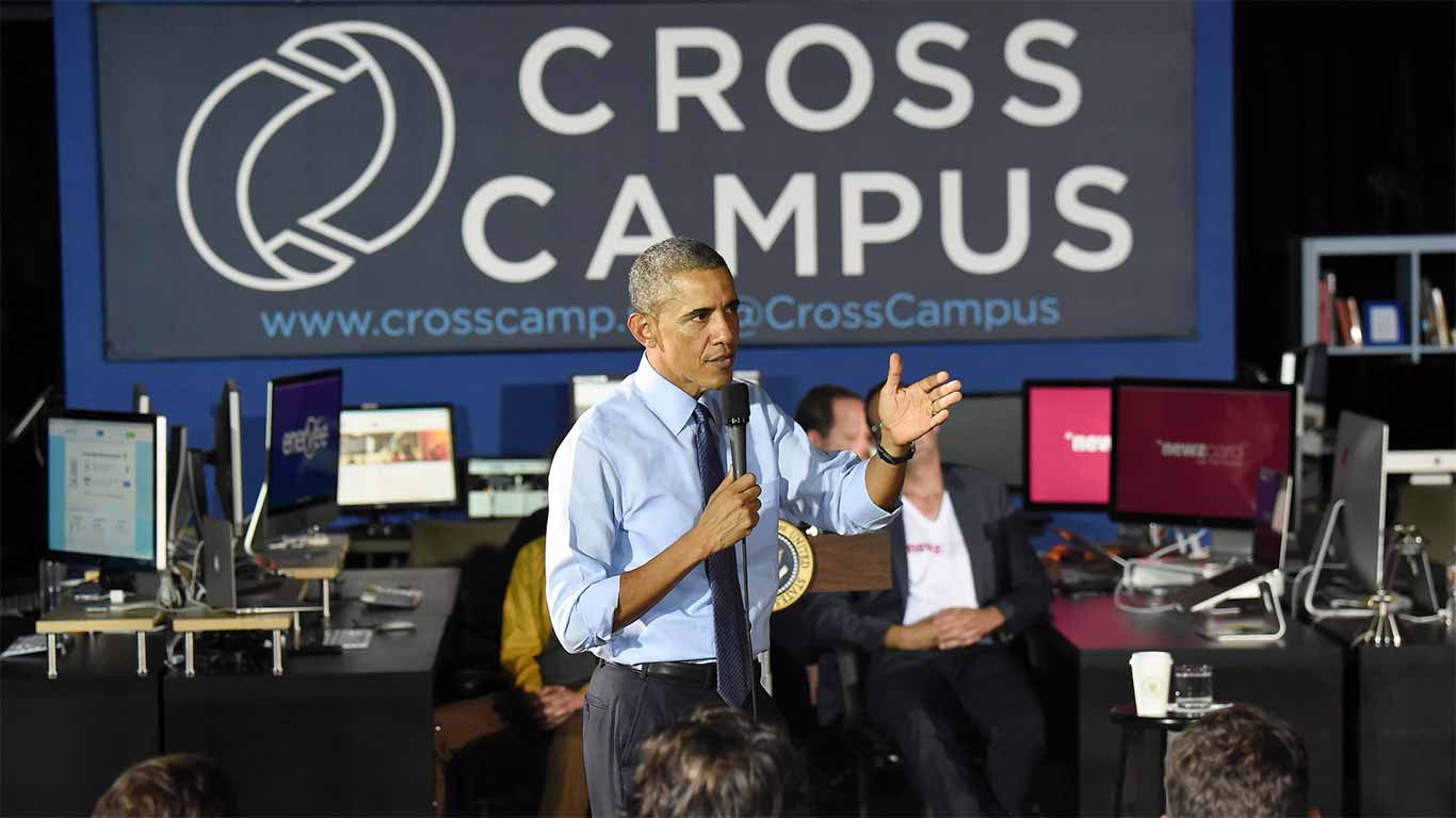
Cross Campus
Preserving Essence, Embracing Change
Cross Campus is a dynamic coworking and office space provider catering to startups in Southern California. Their mission is to foster innovation and collaboration among entrepreneurs and growing businesses. With multiple locations across the region, Cross Campus offers flexible workspace solutions, networking opportunities, and a vibrant community for its members.
Role: UX/UI Designer
Shipped: 2015
Keyword: UX Research, User Testing, Design System, UX/UI Design
My Role
My responsibilities included conceptualizing the new visual identity, creating logo designs, and ensuring the brand's essence was maintained throughout the redesign process. I collaborated closely with the client and our design team to deliver a cohesive and impactful brand refresh.
Challenge
The primary challenge in this rebranding project was to modernize Cross Campus's visual identity while preserving its core essence and maintaining recognition among existing customers. We needed to strike a delicate balance between innovation and familiarity, ensuring the new design would resonate with both current and potential members. Additionally, we aimed to create a versatile logo that could adapt to various applications across digital and physical platforms.

Research
Our research phase involved a deep dive into Cross Campus's brand history, values, and target audience. We conducted interviews with key stakeholders to understand their vision for the company's future. We also analyzed competitors in the coworking space, identifying trends and opportunities for differentiation. This comprehensive research provided valuable insights that informed our design decisions and helped us align the new brand identity with Cross Campus's strategic goals.

Ideate
During the ideation phase, we explored numerous concepts through extensive sketching sessions. Our team generated a wide range of ideas, from subtle evolutions of the existing logo to more radical departures. We focused on stripping down the logo to its most essential and minimalist form, believing this approach would create a strong foundation for a contemporary and versatile design. Throughout this process, we constantly referred back to our research findings to ensure our concepts remained true to Cross Campus's brand essence.


Solution
Our solution was to approach the logo redesign with a more minimalistic feel while maintaining a "techy" and modern aesthetic. We refined the most promising sketches, experimenting with various geometric shapes and typography styles that conveyed innovation and collaboration. The final design featured clean lines and a simplified form that captured the essence of Cross Campus's brand. We also developed a flexible color palette and guidelines for logo usage across different mediums to ensure consistency in brand application.


Outcomes
The rebranding project for Cross Campus resulted in a sleek, modern logo that successfully embodied the company's innovative spirit while maintaining a connection to its roots. The new visual identity was well-received by both the client and their members, reinforcing Cross Campus's position as a leading coworking space provider. The minimalist design proved highly adaptable, functioning effectively across various marketing materials, signage, and digital platforms. Ultimately, the refreshed brand identity helped Cross Campus attract new members and strengthen its presence in the competitive Southern California startup ecosystem.
What I Learned
Working on Cross Campus rebranding project as a brand designer taught me the critical importance of preserving a brand's essence while pushing its visual identity forward. I gained invaluable insights into the delicate balance between honoring an established brand's legacy and introducing fresh, contemporary design elements that appeal to both existing and new audiences. This experience also reinforced the power of minimalist design in creating a versatile and enduring brand identity that can effortlessly adapt to various mediums and contexts.
Read next


Cross Campus
Preserving Essence, Embracing Change
Cross Campus is a dynamic coworking and office space provider catering to startups in Southern California. Their mission is to foster innovation and collaboration among entrepreneurs and growing businesses. With multiple locations across the region, Cross Campus offers flexible workspace solutions, networking opportunities, and a vibrant community for its members.
Role: UX/UI Designer
Shipped: 2015
Keyword: UX Research, User Testing, Design System, UX/UI Design
My Role
My responsibilities included conceptualizing the new visual identity, creating logo designs, and ensuring the brand's essence was maintained throughout the redesign process. I collaborated closely with the client and our design team to deliver a cohesive and impactful brand refresh.
Challenge
The primary challenge in this rebranding project was to modernize Cross Campus's visual identity while preserving its core essence and maintaining recognition among existing customers. We needed to strike a delicate balance between innovation and familiarity, ensuring the new design would resonate with both current and potential members. Additionally, we aimed to create a versatile logo that could adapt to various applications across digital and physical platforms.
Research
Our research phase involved a deep dive into Cross Campus's brand history, values, and target audience. We conducted interviews with key stakeholders to understand their vision for the company's future. We also analyzed competitors in the coworking space, identifying trends and opportunities for differentiation. This comprehensive research provided valuable insights that informed our design decisions and helped us align the new brand identity with Cross Campus's strategic goals.
Ideate
During the ideation phase, we explored numerous concepts through extensive sketching sessions. Our team generated a wide range of ideas, from subtle evolutions of the existing logo to more radical departures. We focused on stripping down the logo to its most essential and minimalist form, believing this approach would create a strong foundation for a contemporary and versatile design. Throughout this process, we constantly referred back to our research findings to ensure our concepts remained true to Cross Campus's brand essence.
Solution
Our solution was to approach the logo redesign with a more minimalistic feel while maintaining a "techy" and modern aesthetic. We refined the most promising sketches, experimenting with various geometric shapes and typography styles that conveyed innovation and collaboration. The final design featured clean lines and a simplified form that captured the essence of Cross Campus's brand. We also developed a flexible color palette and guidelines for logo usage across different mediums to ensure consistency in brand application.
Outcomes
The rebranding project for Cross Campus resulted in a sleek, modern logo that successfully embodied the company's innovative spirit while maintaining a connection to its roots. The new visual identity was well-received by both the client and their members, reinforcing Cross Campus's position as a leading coworking space provider. The minimalist design proved highly adaptable, functioning effectively across various marketing materials, signage, and digital platforms. Ultimately, the refreshed brand identity helped Cross Campus attract new members and strengthen its presence in the competitive Southern California startup ecosystem.
What I Learned
Working on Cross Campus rebranding project as a brand designer taught me the critical importance of preserving a brand's essence while pushing its visual identity forward. I gained invaluable insights into the delicate balance between honoring an established brand's legacy and introducing fresh, contemporary design elements that appeal to both existing and new audiences. This experience also reinforced the power of minimalist design in creating a versatile and enduring brand identity that can effortlessly adapt to various mediums and contexts.
Read next

Cross Campus
Preserving Essence, Embracing Change
Cross Campus is a dynamic coworking and office space provider catering to startups in Southern California. Their mission is to foster innovation and collaboration among entrepreneurs and growing businesses. With multiple locations across the region, Cross Campus offers flexible workspace solutions, networking opportunities, and a vibrant community for its members.
Role: UX/UI Designer
Shipped: 2015
Keyword: UX Research, User Testing, Design System, UX/UI Design
My Role
My responsibilities included conceptualizing the new visual identity, creating logo designs, and ensuring the brand's essence was maintained throughout the redesign process. I collaborated closely with the client and our design team to deliver a cohesive and impactful brand refresh.
Challenge
The primary challenge in this rebranding project was to modernize Cross Campus's visual identity while preserving its core essence and maintaining recognition among existing customers. We needed to strike a delicate balance between innovation and familiarity, ensuring the new design would resonate with both current and potential members. Additionally, we aimed to create a versatile logo that could adapt to various applications across digital and physical platforms.
Research
Our research phase involved a deep dive into Cross Campus's brand history, values, and target audience. We conducted interviews with key stakeholders to understand their vision for the company's future. We also analyzed competitors in the coworking space, identifying trends and opportunities for differentiation. This comprehensive research provided valuable insights that informed our design decisions and helped us align the new brand identity with Cross Campus's strategic goals.
Ideate
During the ideation phase, we explored numerous concepts through extensive sketching sessions. Our team generated a wide range of ideas, from subtle evolutions of the existing logo to more radical departures. We focused on stripping down the logo to its most essential and minimalist form, believing this approach would create a strong foundation for a contemporary and versatile design. Throughout this process, we constantly referred back to our research findings to ensure our concepts remained true to Cross Campus's brand essence.
Solution
Our solution was to approach the logo redesign with a more minimalistic feel while maintaining a "techy" and modern aesthetic. We refined the most promising sketches, experimenting with various geometric shapes and typography styles that conveyed innovation and collaboration. The final design featured clean lines and a simplified form that captured the essence of Cross Campus's brand. We also developed a flexible color palette and guidelines for logo usage across different mediums to ensure consistency in brand application.
Outcomes
The rebranding project for Cross Campus resulted in a sleek, modern logo that successfully embodied the company's innovative spirit while maintaining a connection to its roots. The new visual identity was well-received by both the client and their members, reinforcing Cross Campus's position as a leading coworking space provider. The minimalist design proved highly adaptable, functioning effectively across various marketing materials, signage, and digital platforms. Ultimately, the refreshed brand identity helped Cross Campus attract new members and strengthen its presence in the competitive Southern California startup ecosystem.
What I Learned
Working on Cross Campus rebranding project as a brand designer taught me the critical importance of preserving a brand's essence while pushing its visual identity forward. I gained invaluable insights into the delicate balance between honoring an established brand's legacy and introducing fresh, contemporary design elements that appeal to both existing and new audiences. This experience also reinforced the power of minimalist design in creating a versatile and enduring brand identity that can effortlessly adapt to various mediums and contexts.