Baby Barista
Revolutionizing Baby Formula Preparation
Baby Barista is an innovative baby formula mixer and dispenser designed to simplify the lives of new parents. This smart device combines cutting-edge technology with thoughtful design. The product aims to bring joy to parenthood by addressing the challenges of preparing formula, especially during those sleepless nights.
Overview
Challenge
Create a product that works seamlessly (even at 3 AM) while balancing functionality and emotional appeal
Goal
Design a cohesive brand and user experience that balances functionality with emotional appeal.
Result
An intuitive, single-handed interface and app that simplify formula preparation, helping parents feel supported
My Role
mentored and led 2 junior designers
collaborating with RKS team member (industrial designers, researchers, and engineers)
ensure all visual elements, branding, product interface, and mobile app aligned with the brand's core values and resonated with new parents.
Challenge
The primary challenge was to create a product that went beyond simply dispensing milk. We needed to design a machine that could operate effortlessly for sleep-deprived parents. Additionally, we faced the task of differentiating Baby Barista from competitors in the market. Balancing functionality with user-friendliness while maintaining a cohesive brand identity across the product, interface, and mobile app presented another significant hurdle.
Business Goals
An intuitive and user-friendly interface for sleep-deprived parents
Create a formula dispenser that functions seamlessly during late-night feedings

Formula Dispensers on the market at the time
Research
Our research process began with in-depth interviews involving diverse focus groups, including new parents, single parents, nannies, and doctors. We sought to understand the pain points in formula preparation and the features parents desired in a formula dispenser. This initial research led to the creation of customer journeys, highlighting ideal scenarios for Baby Barista usage. We then developed three distinct personas to represent our key findings, each responding differently across the emotional spectrum.

Pain Points

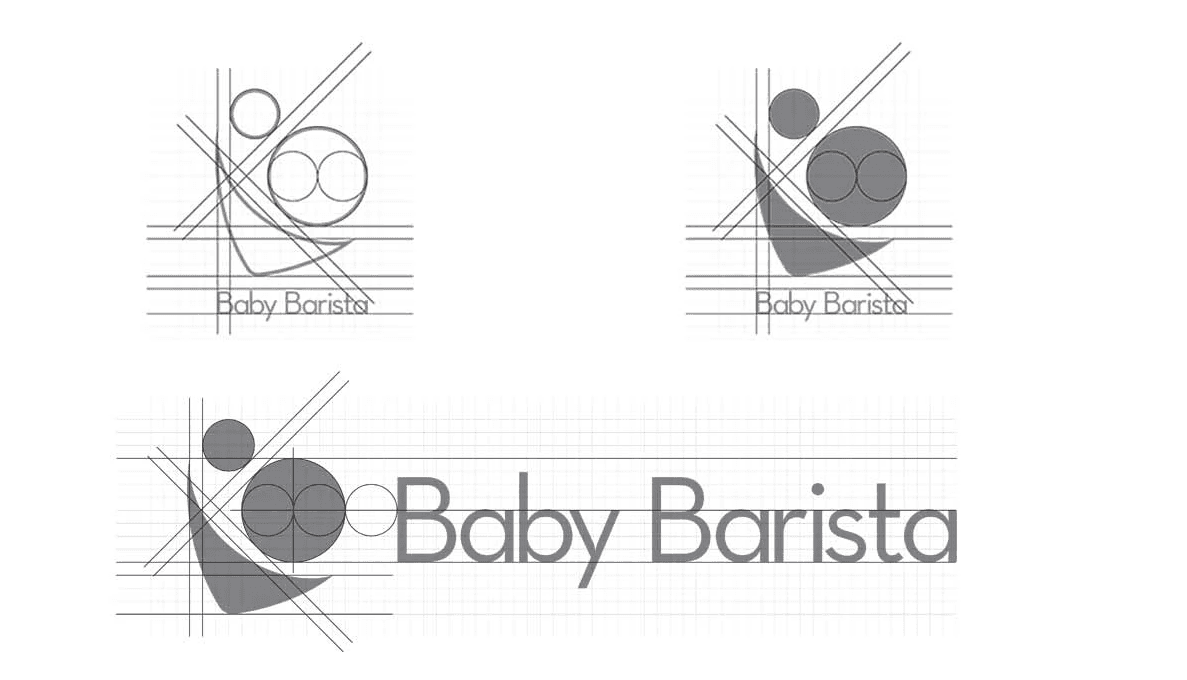
Ideate
The ideation phase involved creating mood boards for the product, brand, and app, exploring various aesthetic directions. We generated multiple logo ideas guided by these mood boards, aiming to create a brand that resonated with adults while remaining relevant to baby care. Simultaneously, we mapped out the product's information architecture and developed wireframes based on our research insights. This phase culminated in a second round of focus group interviews, where we presented our concepts and gathered additional feedback.
Personas
We developed three key personas to represent different user archetypes and their unique needs:
Claudia: first baby, works full-time-formula feeding since 4th month
Rachel: Second baby, works part-time, formula feeding since 6th month
Maggie: First baby, works part-time formula feeding since 2nd week
Outcome: These personas became our guiding "north star," ensuring that every design decision addressed the diverse needs of our target audience.

Customer Journey Map
We mapped out the customer journey and identifying key touchpoints during formula preparation.
Outcome: By visualizing these workflows, we identified opportunities to simplify steps during critical moments, such as reducing complexity for late-night feedings or ensuring seamless app integration for remote use.

Click on image to view in details
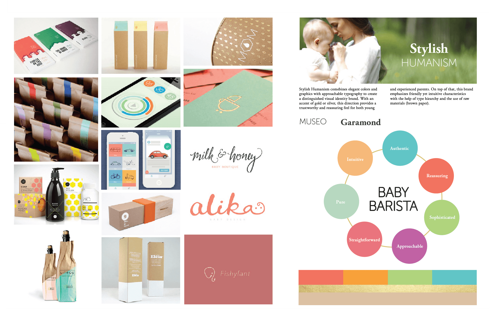
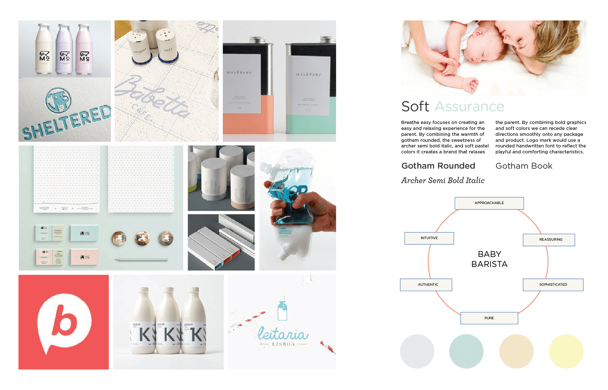
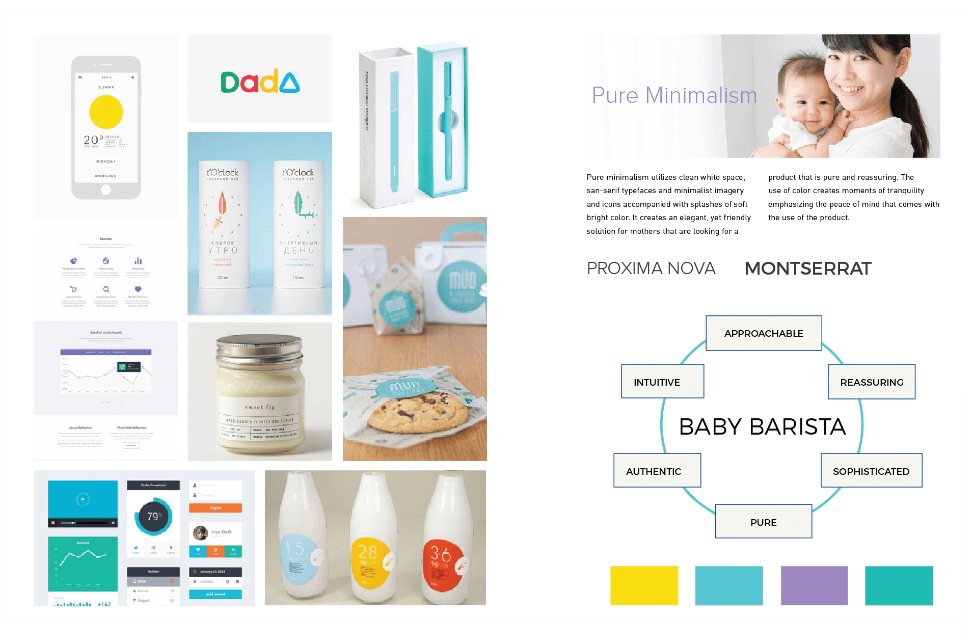
Mood Boards
We created mood boards to explore aesthetic directions for the product, brand, and app:
Warm color palettes to evoke trust and comfort for new parents.
Minimalist design elements to ensure clarity during stressful moments.
Soft textures and rounded shapes to align with baby care themes.
Outcome: A warm yet modern brand identity that resonated with adults while maintaining relevance to baby care.
Click on image to view in details
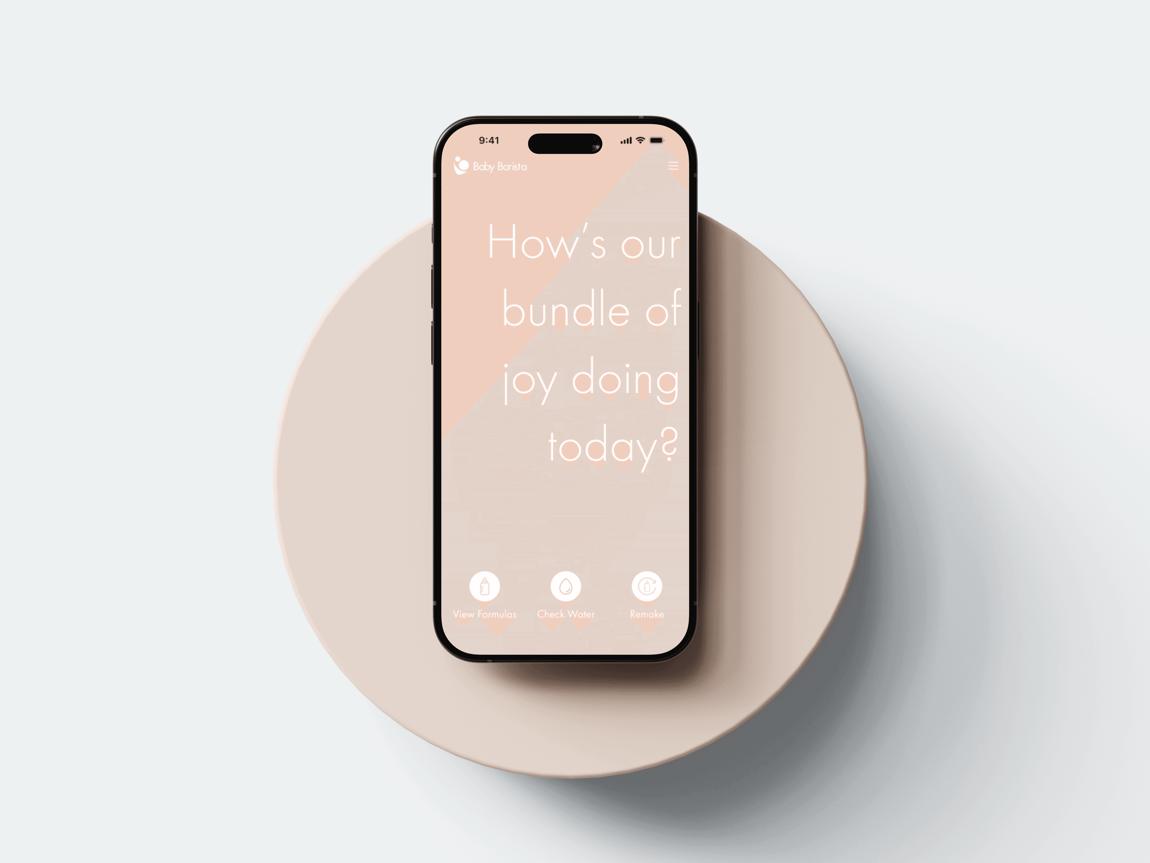
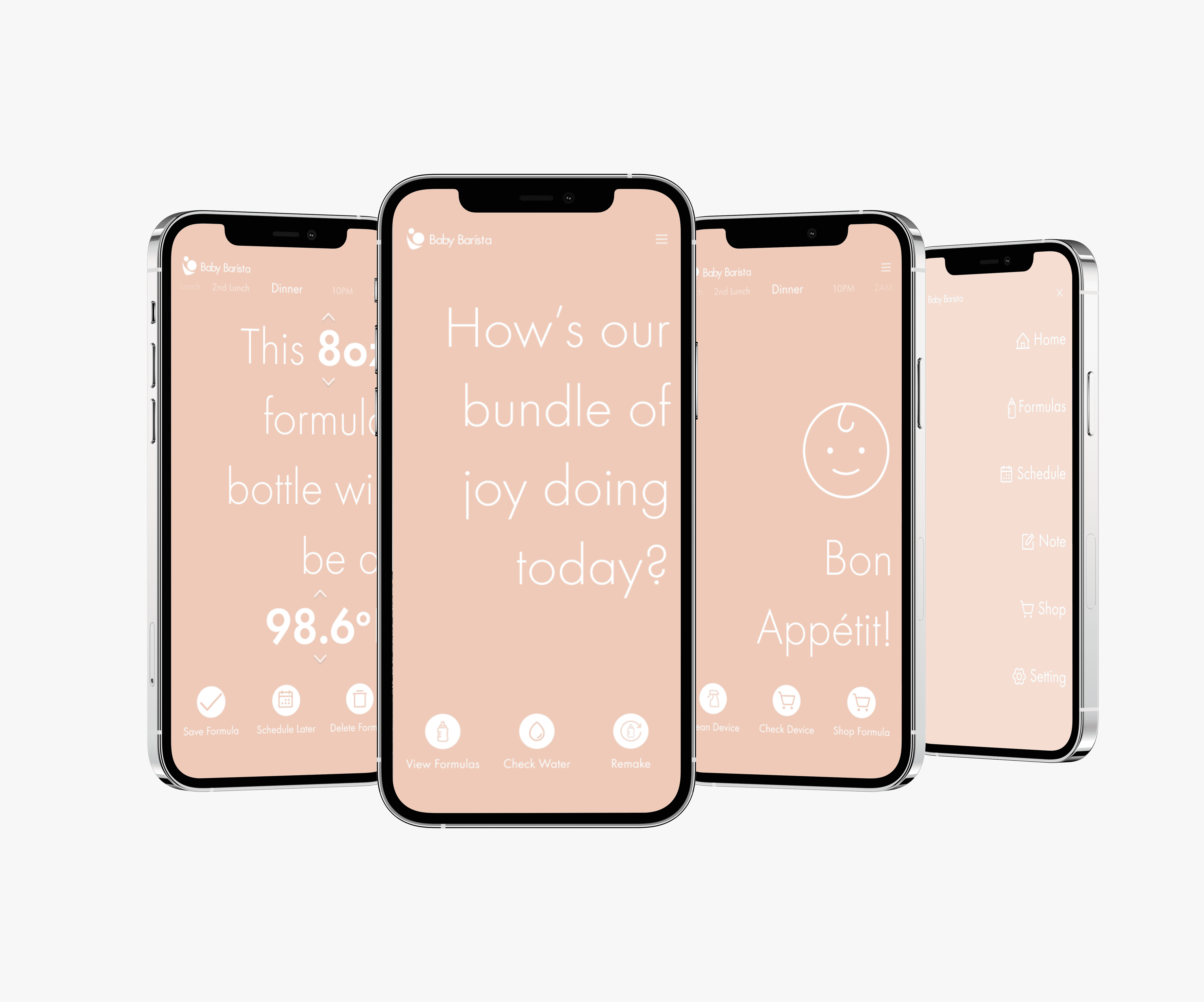
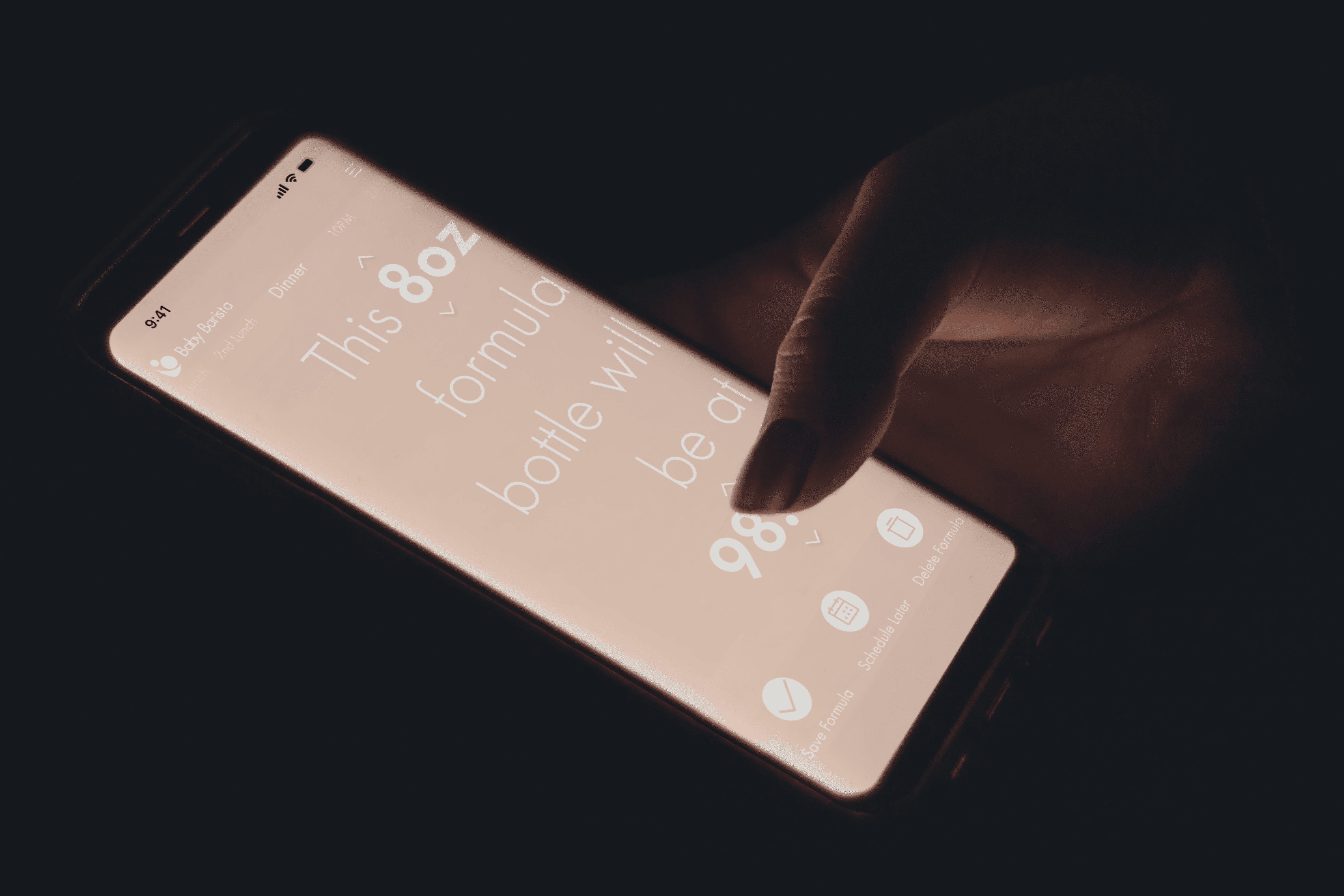
Information Architecture and Wireframe for Dial Screen
We prioritized essential features directly on the device to ensure ease of use:
A clear button layout for preparing bottles with one hand.
Visual indicators for formula-to-water ratios and temperature settings.
A leak-proof design to ensure consistent performance.
Outcome: An intuitive product interface that empowers parents to prepare bottles effortlessly during late-night feedings.


Click on image to view in details
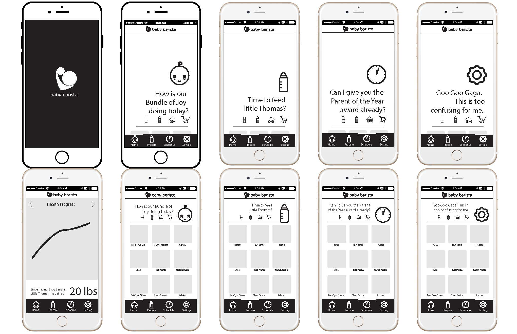
Information Architecture and Wireframes for Mobile App
The mobile app was designed as a companion tool with advanced features:
Remote scheduling of feedings to support working parents like James.
Notifications for caregivers like Sophia when bottles are ready or supplies are low.
Conversational prompts to guide new parents like Emma through setup and usage.
Outcome: A conversational, human-centric app interface that complements the physical product by balancing minimalism with warmth.

Click on image to view in details
Focus Group Testing
We presented low-fidelity prototypes to focus groups for feedback on usability and emotional resonance.
Outcome: Insights from these sessions refined our designs, ensuring they met both functional and emotional needs.


Solution
Based on our research and ideation, we developed a smart, cohesive baby formula mixer that speaks well to the customer. The product interface was designed to function independently of the app, ensuring essential features were accessible directly on the device. We created a conversational, human-centric app interface to complement the physical product, striking a balance between minimalism and warmth. The brand identity was carefully crafted to appeal to adults while maintaining its connection to baby care.
The final design was a cohesive ecosystem combining hardware, software, and branding:
Brand Identity
A carefully crafted visual identity appealing to adults while maintaining its connection to baby care.

Product Interface
Designed for single-handed operation with essential features accessible directly on the device.

Mobile App
A conversational, human-centric app interface that complements the physical product with minimalism and warmth.


Outcome
The final Baby Barista product emerged as a revolutionary solution in the baby formula preparation market. It successfully addressed the needs of sleep-deprived parents with its intuitive interface and smart features. The cohesive brand identity resonated well with our target audience, differentiating Baby Barista from competitors. The mobile app's conversational prompts and essential features enhanced the overall user experience, making formula preparation a less daunting task for new parents. Ultimately, Baby Barista achieved its goal of bringing more joy to parenthood by simplifying one of its most challenging aspects.
30 seconds
to Create a Perfect Bottle
1-handed
Interface and Mobile App
What I Learned
I gained invaluable insights into the importance of creating a cohesive brand experience across multiple touchpoints. The project reinforced the critical role of user research and iterative design in developing products that truly address user needs, particularly for sleep-deprived parents facing the challenges of formula preparation. Perhaps most importantly, I learned the power of balancing functionality with emotional design, creating an interface that not only simplifies tasks but also brings joy and comfort to the parenting experience.